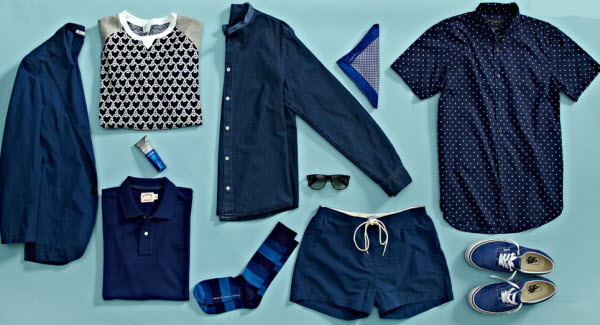
Besides navy blue, I have always loved earth tones, so the 1920s is perhaps my decade of color influence....which is yours?
Read what some top designers say about their what influences their color selections...

ADEAM by Hanako Maeda I am fascinated by International Klein Blue, which was introduced in 1958 by artist Yves Klein. This Bright, Electric Blue is truly one of a kind.
Angelo Galasso The '60s are the years that fascinate me the most. I associate colors like Light Blue and "Vespa" Blue to that era. My taste varies depending on fabrics and styles, it moves in a chameleonic way from the '60s to the '70s and '80s which were the years of my youth.
Barbara Tfank I'm not really influenced by any one decade. In this collection the influence is from the ancient world of the Ottoman Empire.
BCBG We repeatedly look to the '40s; this season we're utilizing the Green hues, earth tones, Nudes and Pale Pinks popular in that era.
Bibhu Mohapatra I am drawn to the '30s and continue to reveal inspiration from this vibrant time period throughout my collections.
Carmen Marc Valvo The 1950's, Corals, Hot Pinks and Aqua.
Charlotte Ronson The '90s; I grew up in that era, so it has a huge influence on me. The rebellious nature of the grunge movement and music of the time is a setting for many of my collections.
Clover Canyon PANTONE is our go-to for so much of our printing ink colors. Every decade has been spot on target for each season's collections.
Ella Moss by Pamella Protzel-Scott I've pulled inspiration from all decades of color. I love that Pantone is a resource for inspiration from the past, present and future.
Hernan Lander Many colors I associate with specific decades have influenced me as a designer, but one of my favorite decades is the roaring '20s. Fashion was inspired by a new age, women threw away their corsets and skirts became shorter and shorter. Women were free to wear feminine silhouettes. This decade inspires my collections today in the dresses with intricate beading, in rich hues in metallic Silver and Gold.
Herve Leger During the '20s, pottery colors were influenced by soft, earth tones that evoke health, youth and paradise. Jewel and gem-toned colors in pastel shades captivate the timeless independent spirit of this era.
Jenny Packham Each season I look to use different colors that appeal to the collection. We do often include a tone of Red with each season. It is a color that always seems to be representative of the mood in some form or another.
Joy Cioci The '20s will always be my favorite and the use of pale dusty colors with embellishments.
Kelly Wearstler Since color and metallic are my signatures not only in clothing design, but also with interiors – I truly love every decade and all colors. It is hard to pick a favorite out of all of them!
Kenneth Cole Black.
Lela Rose I have always loved and been drawn to the dusty pastels of the '40s. From the chalky Wedgewood Blues to the soft Petal Pinks, that era has held an idea of glamour and sophistication that has long influenced my work.
M.PATMOS by Marcia Patmos The '50s in Cuba influences me the most. I think there is a frozen romantic dream of this era that hasn't quite evolved into the modern reality as a result of such a long embargo by the U.S. government. All of our images are kind of idealized from the Hollywood era.
Mara Hoffman We are kind of a "here and now" brand. We pull from so many different eras and places to create our own world, so it's important for us to constantly be considering the old with the new.
Nanette Lepore Throughout my childhood I was surrounded by my father's paintings. The colors of his artwork are an intrinsic part of me and naturally inform my decisions about the color palettes for my collection.
Nicole Miller I've always loved the late '60s to early '70s and all the experimentation that went on. I love exploring new fabrications and printing techniques to breathe new life into the colors and handicrafts of that decade.
Pamella Roland by Pamella DeVos I love how bold the '80s were…But don't tell anyone.
Rachel Roy The 17th and 18th centuries were rich with art and architecture. How this historical past and its aristocratic deeper colors played into the brighter and lighter side of the Age of Enlightenment is inspiring and informs the sense of balance and juxtaposition that I use in my collections.
Sachin + Babi We often look towards our rich Indian heritage for color inspiration, especially the 15th & 16th century Mughal Dynasty paintings, architecture and textiles that never fail to inspire us!
SAUNDER by Emily Saunder The most influential decade for me in terms of style and attitude would be the '70s, but as far as color goes I'm more drawn to the vibrant, pure colors of the '60s. The '70s were too muddied down, there was too much Brown.
Steven Alan Late '60's, early '70's shades of Blues and Yellows. The classic shapes and pops of color are timeless and continue to influence fashion today.
Tadashi Shoji Jewel tones have influenced me as a designer and are almost always incorporated in my collections. They are a classic way to integrate color into your personal wardrobe.
Tia Cibani The 1910s was a period characterized by a rich exotic opulence, when an unconventional approach to color was being tested by designers. The juxtaposition of East meets West is intriguing to me.
Timothy Everest The '20s when they started to use new ways of creating color for art deco – we continually find ourselves referencing this period time and time again.
Tommy Hilfiger All-American shades of Red, White and Blue are the signature of our brand and have remained central in the design process.
Tracy Reese I am influenced by nature. Color is timeless.
Trina Turk The colors of the '70s as seen growing up in California. The fashion, interiors and graphic design of that decade always catch my eye. I love the way that bright colors were often juxtaposed with organic, earthy tones. The combination of sexy neutral with strong color is an essential concept we return to often.
WHIT-NY by Whitney Pozgay I love bright Poppy Red. It makes its way into almost every collection and seems to transcend any specific decade. It always works.
Yoana Baraschi The last decade has most influenced my collection. Each year marks an exciting mixture of hues, but fall 2011 truly inspired me. During every season I look at the art of color and how I can pair it with opposing as well as complimentary textures and structure.