Our Blog

News, Articles & More

Color Combos

Color Psychology & Pink

Color psychology is the study of how colors affect our moods, behaviors, and interactions with others and ourselves. Since I can remember, my two favorite colors were navy blue and camel. More recently, I have added hot pink or cerise and vibrant/kelly green (see my specs!) to that list. Now, I am a wardrobe stylist and personal branding expert so I am aware that colors affect moods and, more specifically, how we show up and move throughout the day. In
Read More »
Colors

2022 color of the year

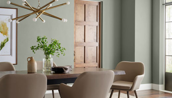
Sherwin-Williams unveiled its 2022 color of the year and it’s 100% aligned with the tone of “the year of transition“! The color is evergreen fog and it’s like taupe, mint green, and beige had a baby….waalah! But after a year of trying to get ahead of the pandemic and its variants, dig ourselves out of political conflicts, heal from a divisive Presidential election, and so much more, it makes sense that such a muted but flexible color would be the choice!

Read More »
Colors

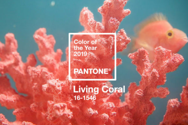
“living” coral is pantone’s 2019 color of the year

While I’m not sure of the difference between “living” coral and non-living coral, so be it! Pantone’s 2019 color of the year, living coral, is bright, effusive, friendly, energizing but soft, and vibrant but slightly mellow. I can play nice with other colors but it’s not made for everyone. I found a few fun pieces that can allow you to participate in the ‘color of the year’ fun without going overboard or doing too much… [show_lookbook_widget id=”410826″]

Read More »
Colors

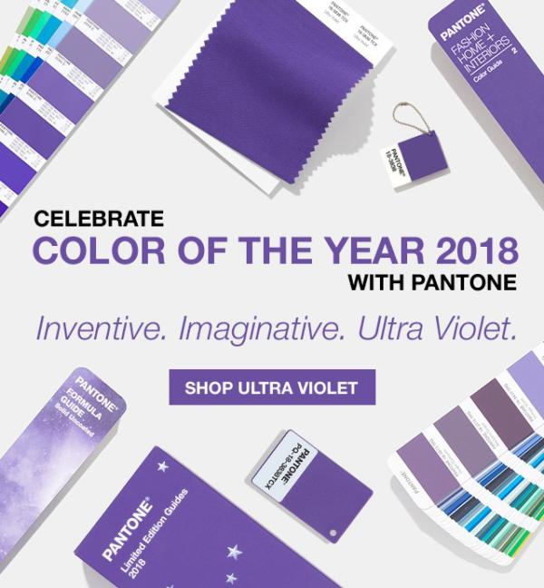
pantone color of the year: violet

I’m not a huge fan of the “fairer” colors but violet can be pretty and we found a few fabulous items to get you started off in the right sartorial direction this year! My favorite (new violet acquisition)….. The violet notebook (I’m a sucker for paper!!!) [show_shopthepost_widget id=”2976389″]

Read More »
Colors

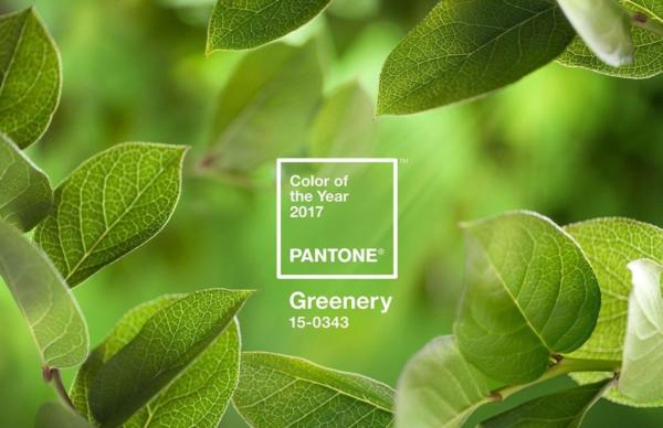
Pantone 2017 Color of the Year – Greenery

Every year, Pantone comes out with its “Color of the Year” and for 2017 it’s Greenery! It’s bright but surprisingly versatile in its pairing. It can be toned down or brightened up with some great vibrants ~ and it’s pretty preppy too! As a tried-and-true navy/camel/red palette girl, I wasn’t sure this color would make a showing in my closet in 2017 but I think it can happen using this color palette… It has hints of my navy and camel!!

Read More »
Bottoms

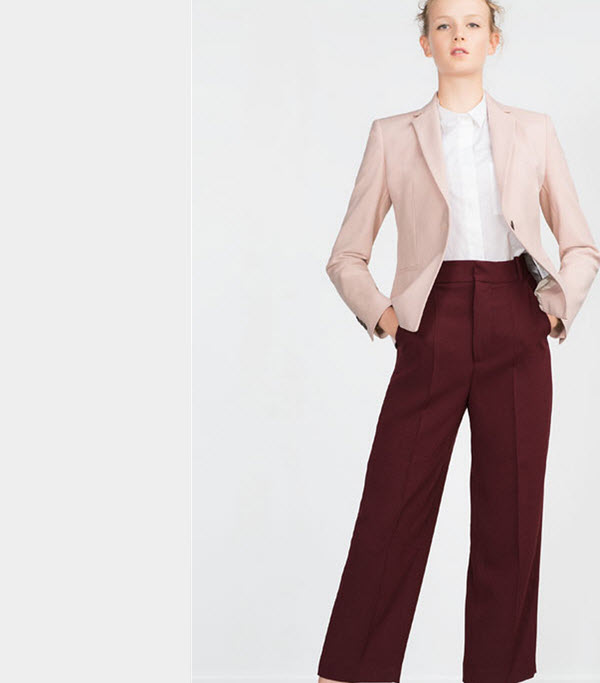
The ONE COLOR to Add To Your Closet This Fall

I know I share the Pantone Color of the Year and what not but, this is not that. I’m talking a color that will set off your boring black but also play nicely with your camels, browns, tans, and khaki colors. Drumroll…..aubergine! [show_shopthepost_widget id=”1042084″] For the fellas, this should be fun because it gives you just a little somethin’ but still works with your dark suits and your casual Friday tan slacks. Note that you can get jiggy with some

Read More »
fall colors, plum, berry
Color Combos

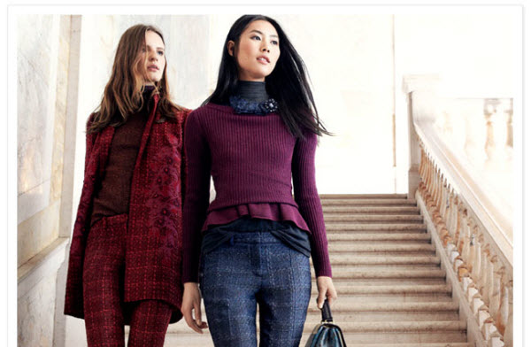
Fall Color: Berry Pretty

Call it plum, wine, burgundy, aubergine – this color palette is running between deep red and violet on the spectrum, and is everything rich, luscious, and saturated. It’s BERRY pretty……

Read More »
Colors

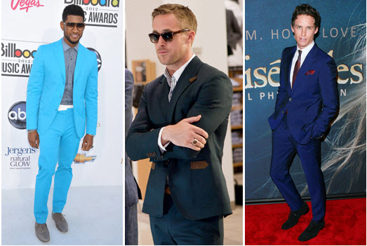
The Navy Suit Blues

I love navy blue {who doesn’t know that if they’ve read my posts?!} so, when I read this article in Details Magazine, it only made sense to share. Blue is a very conventional color but the predominant shades of blue for this season are anything but…. Know your blues: cornflower ~ a washed-out azure, it’s a a more common color for a button-down shirt than a suit and looks terrific with a darker blue like navy della robbia blue ~

Read More »
Colors

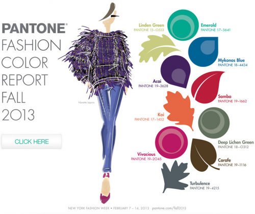
Fall Color Report 2013

By now, you know Pantone’s Color of the Year is Emerald Green but, here’s a look at all of the hot colors of the year….on the runways, in the stores, and sure to show up in your closet! Note: I’ve added just two hints of emerald green to my closet as it’s not my color ~ I’m sticking with navy, red and camel.

Read More »
Colors

Men’s Fall Color Report 2013

I’m not suggesting that men should walk around sporting bright red or emerald green on an everyday basis but, a hint or pop of color in a sea of navy can do wonders for morale! If someone “forced” your hand, which color would you add to your closet? I’d suggest samba or acai ~ both are rich, deep and lush but not too brash so as to offend your neutral senses….

Read More »
Colors

What Is Your Decade of Color Influence?

Besides navy blue, I have always loved earth tones, so the 1920s is perhaps my decade of color influence….which is yours? Read what some top designers say about their what influences their color selections… ADEAM by Hanako Maeda I am fascinated by International Klein Blue, which was introduced in 1958 by artist Yves Klein. This Bright, Electric Blue is truly one of a kind. Angelo Galasso The ’60s are the years that fascinate me the most. I associate colors like Light Blue

Read More »
Colors

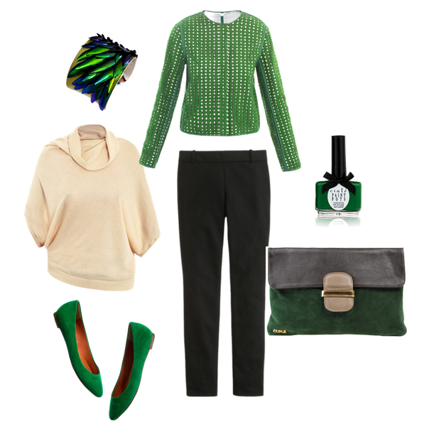
Emerald: Pantone 2013 Color of the Year

Last year it was Tangerine Tango. The year before it was Honeysuckle. 2010 it was Turquoise. This year, Pantone’s color of the year is Emerald: a vibrant, rich and multi-faceted color because it plays so nicely with warm and cool tones. By virtue of my recent fascination with camouflage and my wardrobe update of navy blue, I am truly excited by this! What am I going to run and scoop? I’m not 100% sure because I need to feel it

Read More »
Colors

Color Inspiration: Tangerine

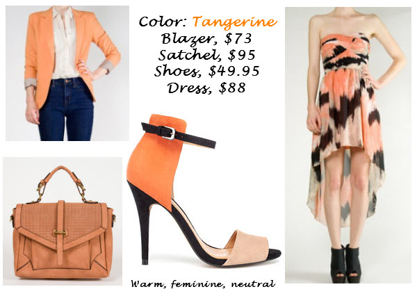
Shopping: Ark & Co tangerine blazer ($73), Urban Expressions heart satchel ($95), SugarLips peach print hi-lo dress ($88), Zara basic sandals ($49.90). Tangerine is a soft bright color that provides warmth to most skin tones, but is feminine. It plays nicely with black, navy or camel, so it’s a worth while spend!

Read More »

Mad About Hue

Ever seen someone who takes “matching” to a whole new level? [e.g. ~ a brown suit and red shoes, red necklace, red ring, red belt, red purse, red lipstick, and red stockings]. This is someone who may have missed the beauty of hueing ~ using a gradation or variety of a color.  [nggallery id=61] Style note: “matching” can add to the overall frustration of dressing while, hueing allows much more flexibility in coordinating looks!

Read More »
Colors

Muddy Earth Color Palette

Most of us complain that we don’t get enough color in our world, but this picture shows us how gorgeous and haute ‘muddy earth’ can look. The colors are muted, there are varying textures (I spot tweed!), and the fringe adds a touch of bohemian to the mix.

Read More »

Brown

Brown– dominating earth tone from which all others come; can be interchanged with black .

Read More »

Pink

Pink– gently reminds us what it means to be in touch with our “feminine” side .

Read More »

Green

Green– leaves us feeling safe (it’s in the middle of the color spectrum)….but can have some edginess .

Read More »

Send us a message

If you have general questions, feel free to use the form below to send us a quick message.