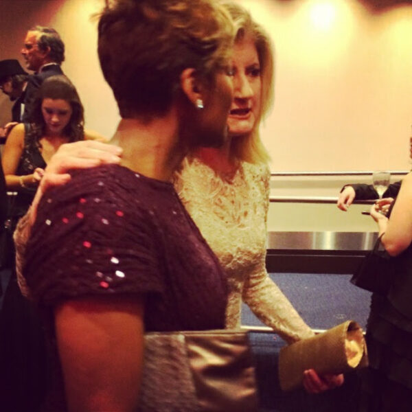
textural print mixing
It’s official: mastering the prints and patterns mix is the chicest way to look like you know exactly what you’re doing—even if you got dressed in five minutes flat.
Mixing prints is everywhere right now. From street style to C-suites (yes, you can wear stripes and florals to a board meeting), the new power move is intentional pattern play. But if the idea of mixing paisley with polka dots sends you into a style spiral, don’t worry—I’ve got a formula for that.
Let’s break it down: first, a beginner’s approach. Then, we level up.
🏴 Print Mixing 101: Beginner Edition
- Same color family, different print
Stick to two prints that share similar tones > black and white, blues and greys, blush and camel - Contrast scale
Pair a larger print (like florals or wide stripes) with a smaller one (like microdots or fine checks) to balance the visual weight - Ground with a neutral
Use solids or neutral accessories (think: tan belt, white shoes) to anchor your outfit - Two’s company, three’s a crowd
Keep it simple with two patterns max until you’re more confident
→ Check out InStyle’s take on mixing prints (along with great photos) or see how one of my faves, Anthropologie, goes bold with feminine prints.
🏁 Expert-Level Print Mixing
- Mix pattern families: Florals + stripes, checks + animal print are doable if the palette plays nicely
- Add textural prints: Think jacquard, brocade, or embossed fabrics for subtle contrast
- Make accessories part of the mix: Leopard heels or a patterned clutch can be the connector, or the statement
Mastering the prints and patterns mix is more about confidence, composition, and a little bit of play.
Want help turning up the volume? Call us on the Style Hotline, 209-STYLISH, because friends don’t let friends mix irresponsibly, or check out this post on mixing prints like a pro!