The color psychology of pink in fashion goes far beyond softness or sweetness—it’s a quiet authority, a bold whisper. As a wardrobe stylist for executives, I use the color psychology of pink in fashion to help clients shift perception, signal openness, or soften an otherwise commanding look. Whether it’s blush, bubblegum, or power pink, the color psychology of pink in fashion offers professionals a strategic edge—if you know how to use it.
Color psychology is the study of how colors affect our moods, behaviors, and interactions with others and ourselves.
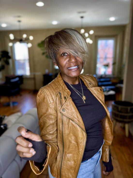
Since I can remember, my two favorite colors were navy blue and camel. More recently, I have added hot pink or cerise and vibrant/kelly green (see my specs!) to that list. Now, I am a wardrobe stylist and personal branding expert so I am aware that colors affect moods and, more specifically, how we show up and move throughout the day. In working with my clients, I take into account their favorite colors as well as those that seem to make them glow…
During a recent trip to London, I did a quick “photoshoot” – see gallery above – while I was waiting for my friend to get ready so we could go strolling the mean streets of Knightsbridge. I changed out of my tee into a cerise-colored cashmere sweater from Naadam and it felt like the camera was calling me. I won’t share all of the shots but, here’s what color psychology says about pink:
- Bright colors convey confidence
- Color placement matters
- Lighter colors communicate approachability
- Deeper pinks suggest sophistication
What is your favorite color, and let’s see what it says about you?
Check out this post on how your outfits can influence your mood!
Don’t know your favorite color or just want to be more intentional about adding color to your wardrobe? Let’s talk – grab one of the remaining complimentary Step Into 2025 consults, and let’s make sure you’re feeling your best!